
News
Toronto in Cream and Navy: The Leafs 2026 Hometown Remix Hockey Jersey
Nov
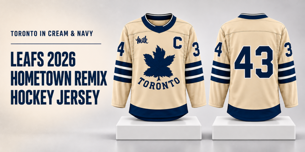
A hockey jersey can hold its own in an outfit long before anyone checks the name or number. Color, proportion, and the way a crest sits on the chest all shape that first impression. The Leafs 2026 Hometown Remix Hockey Jersey draws attention through a warm cream background and deep navy graphics, bringing a vintage mood to a familiar Toronto identity.
For US fans who want Toronto hockey apparel with a quieter color palette, this design offers plenty to consider. The large maple leaf establishes the connection immediately, while the curved TORONTO lettering, striped sleeves, and contrasting neckline give the jersey definition from several angles.
Leafs 2026 Hometown Remix Hockey Jersey – The Details Behind Its Cream and Navy Look
A Cream Background That Changes the Whole Impression
The cream-colored body is the starting point for this jersey’s appeal. It gives the dark graphics a warm backdrop and creates a softer visual effect than a bright white base would. Across the shoulders, chest, and lower sleeves, uninterrupted areas of cream leave room for the larger design elements to stand out.
That open space matters. The maple leaf, captain’s letter, sleeve digits, and chest script are all substantial enough to draw attention individually. Keeping the background simple helps those elements feel arranged, with a clear hierarchy: the leaf comes first, the city name follows, and the smaller upper-chest details reward a closer look.
Cream also gives shoppers more options when putting an outfit together. It can sit comfortably beside faded denim, charcoal pants, or a navy cap. If your wardrobe already contains neutral basics, the jersey introduces a strong hockey reference without requiring a completely new set of matching pieces.
The Maple Leaf and TORONTO Lettering Give the Front Its Character
A large navy maple leaf occupies the center of the front. Its pointed edges create an irregular outline against the cream body, while darker internal lines add visible detail within the shape. The broad silhouette makes the graphic easy to recognize; the interior pattern gives it something to offer at closer range.
Beneath the leaf, TORONTO appears in uppercase letters arranged along a curve. The lettering forms a wide base under the graphic and gives the front a clear geographic identity. Its sturdy letterforms also suit the scale of the leaf, keeping the word from looking like an afterthought.
The relationship between these two elements is especially effective when considering how to wear the jersey. An open jacket can frame the central graphic, but a jacket zipped too high will cover the lettering. Wearing the jersey untucked and letting the front hang freely preserves the complete composition.
For someone choosing this piece primarily for its Toronto connection, the front is the strongest reason to give it a closer look.
Navy Sleeve Bands Add Structure Around the Arms
The sleeves carry broad navy bands separated by narrow pale lines. Their horizontal arrangement adds structure to the long sleeves and repeats the dark color used in the central graphic. Seen beside the cream torso, the bands give the jersey a clear outline around the arms.
There is a useful difference in scale here. The maple leaf is a single large shape, the city name is a line of lettering, and the sleeves use repeated bands. Each area has its own treatment, yet the limited palette keeps the whole garment coordinated.
These stripes also influence styling. They already supply a substantial pattern, so plain pants usually make an easy companion. Busy camouflage, large plaid, or another oversized graphic may compete with the sleeves. For a straightforward game-day outfit, dark jeans and simple sneakers give the banding enough space to remain visible.
The Collar, Captain’s C, and Chest Script Reward a Closer Look
A navy neckline brings the darkest color up toward the face. The reference images show a shaped front opening with a narrow pale trim, creating a defined edge above the cream chest. This helps the upper portion feel connected to the navy hem and sleeve bands.
An outlined captain’s C sits on the wearer’s left chest. On the opposite side, the script word Milk introduces a different style of lettering. The contrast between the block C and flowing script adds variety without expanding the color palette.
Placement keeps these smaller elements separate from the main crest. They sit high enough to remain visible above the maple leaf, with cream space between them. When the jersey is layered over a plain crewneck shirt, that arrangement gives the neckline and upper chest room to read clearly.
The mockups differ in their collar branding. Anyone who cares about a particular neck marking should examine the selected product image closely before ordering.
Sleeve Numbers and Back Graphics Deserve Their Own Check
The reference images show large outlined navy digits on the upper sleeves, with a 4 visible on one side and a 3 on the other. Pale borders separate the numbers from the cream background and connect them visually to the outlined C.
The back requires more attention because the available mockups show different treatments. One has a large outlined 43 centered on the rear, while another has a plain cream back. These are meaningful differences for a shopper, especially someone who wants a specific numbered look or a simpler rear panel.
Treat the front and back as two parts of the same purchase decision. A front image may establish the color and crest you like, but the rear image determines how the jersey looks when you turn around. Confirm both views for the option you intend to order.
A pictured number also does not establish that custom names or alternate numbers are available. Use the choices explicitly offered in the listing, and ask about any detail that remains unclear.
A Navy Hem Finishes the Long Hockey Silhouette
A broad navy band runs along the bottom of the jersey. It gives the cream torso a defined lower edge and echoes the sleeve stripes without repeating their full pattern. In the reference images, the lower edge also has a gently rounded shape that suits an untucked presentation.
The long sleeves and substantial body create a recognizable hockey silhouette. Visible shoulder and panel lines add structure to that shape, while the textured appearance in the mockups gives buyers areas to inspect more closely.
Those visual details cannot establish fabric composition, garment weight, stretch, or how the graphics are applied. If embroidered lettering, a particular material, or a specific construction method matters to your purchase, look for a written specification or request confirmation.
For styling purposes, the hem is worth keeping visible. Tucking the jersey into pants would interrupt the navy border and change the proportions of the front. Letting it fall naturally gives the design the most room.
Why the Hometown Remix Context Matters
The NHL announced Hometown Remix as a league-wide uniform and apparel program for the 2026–27 season.
For this cream-and-navy design, the visual appeal lies in the combination of familiar Toronto imagery and a warm, vintage-looking palette. The city name remains prominent, and the leaf remains the focal point, giving fans clear points of recognition.
That context can help explain the product name, but shoppers should assess the retailer’s item on its own specifications. Program naming and visual resemblance alone do not establish the manufacturer, licensing status, or construction of a particular listing.
How to Build an Outfit Around This Jersey
Start with dark blue jeans if you want an uncomplicated combination. The denim picks up the navy graphics while allowing the cream body to remain the brightest part of the outfit. White, cream, or navy sneakers can finish the look without introducing another dominant color.
Charcoal pants offer a slightly sharper alternative for a watch party or casual evening out. Their darker tone gives the long jersey a defined outline, especially around the hem. Keep the pants relatively simple so the sleeve bands and chest graphics remain the main visual features.
For cooler weather, consider a plain layer underneath. A cream or white crewneck can keep the neckline visually light; navy can make the collar area feel more continuous. Before choosing a thick hoodie, check the jersey’s measurements against the space that extra layer will need.
An outer jacket changes how much of the design is visible. Worn open, it can frame the leaf and city name. If you expect to keep your jacket closed most of the evening, consider whether you would prefer a lighter base layer so you can comfortably show the jersey indoors.
Accessories can stay minimal. A plain cap in one of the jersey’s main colors is enough to connect the outfit. The chest already carries several distinct elements, so additional large graphics are optional.
Choosing a Size for the Way You Plan to Wear It
The right size depends on both your measurements and your intended layers. A jersey worn over a thin T-shirt needs a different amount of room from one worn over a sweatshirt. Decide on that use before comparing sizes.
Lay a garment you already like on a flat surface and measure its chest width and length. Compare those figures with the product’s size chart, checking whether the chart describes garment measurements or body measurements. That distinction prevents an easy sizing mistake.
Pay attention to sleeve length as well. The upper-arm digits and lower sleeve bands occupy specific areas, so excessive sleeve length can change where those features sit when you bend your arms. Body length matters for the same reason: it determines where the navy hem lands.
If you fall between sizes, compare the actual dimensions and the seller’s fit guidance. Automatically sizing up may produce more length than you want, even if the extra chest room sounds appealing.
What to Confirm Before Making It a Gift
This jersey could suit someone who enjoys Toronto hockey, cream-and-navy clothing, or large crest-centered sportswear. A useful gift decision starts with the recipient’s habits: whether they wear jerseys regularly, prefer numbered backs, or usually choose simple tops.
Sizing is often the most important detail to settle quietly. Comparing measurements from a jersey they already own is more useful than guessing from their usual T-shirt label. Also consider whether they tend to layer their hockey apparel over sweatshirts.
Before ordering for a birthday, holiday, or planned game, review the estimated production and shipping windows. Check the return terms for the exact item as well. Those practical details help you choose with confidence without relying on assumptions about delivery or exchanges.
Where to Buy the Leafs 2026 Hometown Remix Hockey Jersey
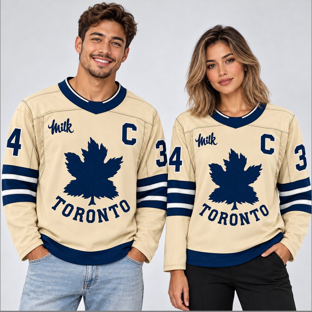
To review the current product options, visit the Leafs Hometown Remix Hockey Jersey at bigfirefashion.com.
Begin with the front and back images for your preferred option. Confirm the collar treatment, sleeve digits, rear graphic, and any name or number choices explicitly offered. Then compare the size chart with your measurements and read the available material and care information.
Before completing your order, check the current price, shipping charges, estimated delivery window, and return conditions. If a detail that matters to you is missing, request clarification first. The cream-and-navy design gives you a clear visual starting point; the listing’s specifications should complete the purchase decision.
Conclusion
The appeal of this Leafs jersey comes from a few well-defined elements: a warm cream body, a large navy maple leaf, curved TORONTO lettering, and strong bands around the sleeves and hem. Smaller details at the chest add interest, while the limited palette gives the design several straightforward styling options.
For a US fan considering a Toronto hockey jersey, this is a look worth examining from both sides. Choose the version whose graphics you prefer, confirm the measurements and construction details, and build the outfit around the cream-and-navy combination that gives the design its character.
