
News
The “Whitney Effect”: How a Simple Spittin’ Chiclets Hat Became This Season’s Must-Have Viral Accessory
Jan
The Aesthetic of an Icon: A Deep Dive into the Ryan Whitney Spittin’ Chiclets Script Hat
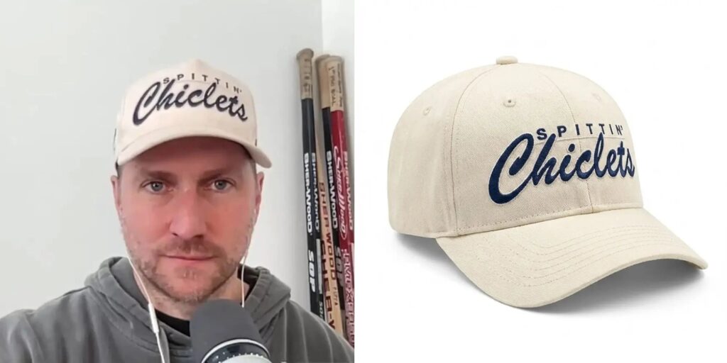
In the world of hockey culture, few names carry as much weight in the digital age as Ryan Whitney. The former NHL defenseman turned media mogul has, alongside Paul Bissonnette and Rear Admiral, transformed the way fans consume the sport through the Spittin’ Chiclets podcast. But beyond the locker room stories and the “not a big deal” catchphrases, a distinct fashion sense has emerged from the Barstool Sports hockey universe. At the center of this style evolution sits a specific piece of headwear that has become a staple for fans and lifestyle enthusiasts alike: the Ryan Whitney Spittin Chiclets Hat.
This isn’t just a piece of merchandise; it’s a design study in how to blend vintage sports aesthetics with modern casual wear. In this deep dive, we’ll explore the nuances of this specific hat, why it resonates so deeply with the North American audience, and what makes it a standout piece in the crowded market of sports-related apparel.
The Power of the “Off-White” Palette
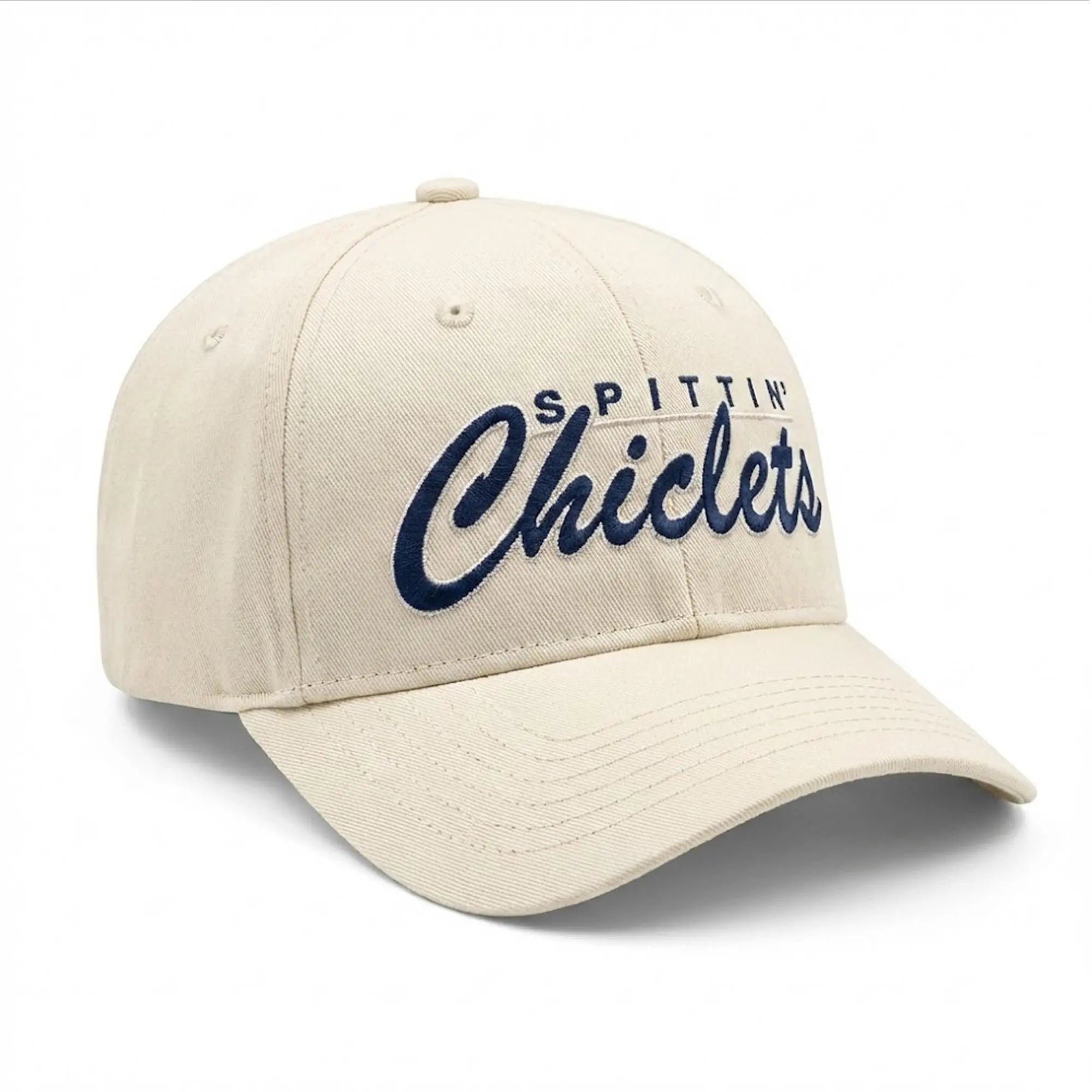
The first thing that strikes you about the Ryan Whitney-endorsed Chiclets hat is the color. While most sports merch leans into high-contrast, primary colors—bright reds, stark whites, or deep blacks—this hat opts for a cream or “natural” base.
In the world of fashion, cream is a sophisticated alternative to white. It carries a “vintage” or “heritage” feel, reminiscent of 1950s baseball uniforms or old-school wool hockey sweaters. For the modern wearer, this off-white tone provides a softer look that complements a wider variety of skin tones and outfits. It doesn’t scream for attention the way a bleach-white hat does; instead, it offers a weathered, lived-in vibe that suggests the wearer has a refined sense of history.
The choice of navy blue for the embroidery is the perfect anchor. Navy and cream are a timeless pairing, often associated with collegiate style and “East Coast” prep. By choosing these colors, the designers moved the Spittin Chiclets brand away from the “loud” energy of typical internet merch and into the realm of legitimate lifestyle fashion.
Breaking Down the Script Typography
The centerpiece of the hat is, of course, the “Chiclets” script. Typography plays a massive role in how a brand is perceived, and the choice here is intentional.
The word “Chiclets” is rendered in a thick, cursive script that mimics the classic “tail” logos of mid-century American sports teams. This script style evokes a sense of nostalgia—a nod to the days of outdoor rinks and the “Original Six” era. It feels authentic.
Above the flowing script sits the word “SPITTIN’” in a clean, sans-serif block font. This juxtaposition is a masterclass in balance. If both words were in script, it would look too busy; if both were in block letters, it would look like a standard corporate giveaway. The contrast between the rigid, modern “SPITTIN’” and the fluid, classic “Chiclets” mirrors the podcast itself: a modern, digital-first show that is rooted in the old-school traditions and “grittiness” of hockey.
The embroidery itself is raised (often referred to as 3D embroidery), which gives the hat a tactile quality. When you run your hand over the front panels, you can feel the density of the thread. This adds a layer of “premium” feel that fans of Ryan Whitney have come to expect.
Structural Integrity: The Fit and Form
A hat is only as good as its “silhouette.” Based on the visuals, the Ryan Whitney Chiclets hat follows the relaxed “dad hat” or “unstructured” profile, though it maintains enough body to hold its shape when worn.
The Crown: It features a mid-to-low profile. This is crucial for the “everyman” look. Unlike the high-crown “trucker” hats or the rigid “snapback” style popularized in the early 2010s, this profile sits closer to the head. It follows the natural curve of the skull, making it a more versatile choice for different head shapes.
The Brim: The brim comes with a slight, natural curve. This is the “Goldilocks” of brim styles—not too flat like a street-style cap, and not too aggressively curved like a performance running hat. It provides just enough shade while framing the face perfectly.
The Fabric: Constructed from a heavy-duty cotton twill, the hat is designed for durability. Cotton twill is breathable, making it suitable for both a stuffy hockey arena and a summer afternoon on the golf course. As the hat ages, the cotton will likely develop a unique patina, further enhancing that vintage aesthetic.
The “Ryan Whitney” Influence: Why This Hat Works
To understand the appeal of the product, you have to understand the man often seen wearing it. Ryan Whitney represents a specific archetype in North American sports: the retired pro who is still “one of the boys.” His style is “effortlessly casual.”
In the provided image, Whitney is seen wearing the hat with a simple grey hoodie and wired earbuds—the universal uniform of the modern podcaster. The hat acts as the focal point of an otherwise understated outfit. This is why the product has been so successful in the US and Canadian markets; it fits into the “athleisure” trend without being overly technical. It’s a hat you can wear to the gym, to the grocery store, or to a casual bar without looking like you’re trying too hard.
Whitney’s endorsement isn’t just about a logo; it’s about a lifestyle. Wearing this hat signals that you are part of a community that understands the “insider” language of hockey—the chirps, the grind, and the specific humor that the Spittin’ Chiclets crew has popularized globally.
A Cultural Signal: “If You Know, You Know”
In marketing, there is a concept called “quiet luxury” or “signaling.” While the Spittin’ Chiclets brand is hardly quiet, this specific hat design is more subtle than their earlier, brighter merchandise.
For the uninitiated, it’s just a nice-looking, vintage-inspired cap. But for the hockey fan, it’s a cultural badge. It identifies the wearer as a listener, a fan of “Whit” and “Biz,” and someone who appreciates the culture surrounding the game as much as the game itself.
The “Chiclets” name itself is a clever nod to hockey history—referring to the teeth that players often lose during the course of their careers. By putting this “inside joke” in a beautiful, script-style font on a cream-colored hat, the brand has elevated a gritty hockey reference into a piece of wearable art.
Versatility Across the Seasons
One of the reasons this specific colorway (Cream/Navy) is so popular in the US market is its year-round versatility.
Spring/Summer: The light cream color reflects heat better than dark navy or black hats, making it a favorite for the golf course—a place where Whitney himself spends a significant amount of time.
Fall/Winter: The navy accents and heavy cotton construction pair perfectly with flannels, denim jackets, and the heavy hoodies synonymous with “hockey weather.”
Unlike a team-specific hat (like a Boston Bruins or New York Rangers cap), this hat isn’t tied to a city or a win-loss record. You can wear it anywhere in the country without starting a rivalry-fueled argument, yet you’ll still find yourself getting a “nice hat” nod from fellow hockey fans in the airport or at the rink.
The Craftsmanship in the Details
When examining the hat closely, the attention to detail is evident. The top button (the “squatchee”) matches the cream fabric of the crown, maintaining a monochromatic look that allows the navy logo to pop. The eyelets—the small holes designed for ventilation—are also stitched in matching cream thread.
These small choices matter. They prevent the hat from looking “cheap.” When a brand takes the time to match the eyelet thread and the top button to the fabric, it shows a commitment to the overall design vision. The stitching along the brim is clean and parallel, providing the structural support needed to keep the curve consistent over months of wear.
More Than Just a Podcast Hat
The Ryan Whitney Spittin’ Chiclets Script Hat is a testament to the power of thoughtful design in the creator economy. It successfully bridges the gap between “fan merch” and “high-quality lifestyle apparel.”
By leaning into a vintage aesthetic, choosing a sophisticated cream-and-navy color palette, and focusing on a versatile “dad hat” silhouette, the team at Barstool Sports created something that transcends the podcast. It’s a piece that honors the history of the sport while fitting perfectly into the wardrobe of the modern, style-conscious fan.
Whether you’re a die-hard listener who has been there since episode one or someone who simply appreciates a well-made, aesthetically pleasing baseball cap, the Whitney Script hat stands as a gold standard in sports-lifestyle branding. It doesn’t need to shout to be heard; its design speaks for itself, carrying the legacy of the “Chiclets” brand with every wear.
