News
The Vikings’ 2026 Mexico City Shirt Brings Lucha Libre to Game Day
Oct
A football shirt can capture a place as clearly as it represents a team. The Vikings Los Vikings En La Ciudad De Mexico 2026 Shirt does exactly that, bringing Minnesota fandom into a design centered on Mexico City. For supporters putting together a watch-party outfit, planning a football trip, or choosing something different for their weekly rotation, it offers a specific connection to the 2026 season.
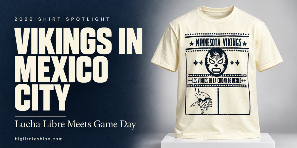
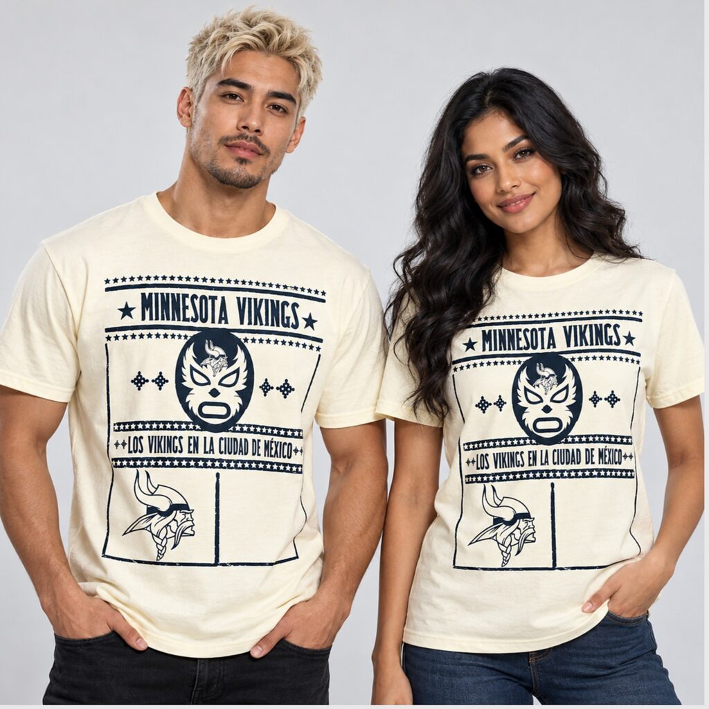
The featured product images show a cream-toned, short-sleeve crewneck with a large navy front graphic. Its character comes from the combination of Spanish lettering, a wrestling mask, stars, and recognizable Viking imagery. Those elements give shoppers something worth looking at closely: a design with a clear focal point, several smaller details, and a layout that resembles a printed event poster.
Vikings Los Vikings En La Ciudad De Mexico 2026 Shirt – The Details Behind the Design
A Lucha Libre Mask Gives the Shirt Its Personality
The mask occupies the center of the upper graphic, immediately below the team name. Its dark outer shape contrasts with light facial details, including sharply outlined eyes, a small nose shape, and an open oval mouth. Curved, pointed accents sweep upward beside the eyes, giving the illustration an expressive appearance even without a full wrestler’s figure.
There is a small Viking head at the mask’s forehead. That placement matters because it joins the two main references within a single illustration. Minnesota identity is built into the mask itself, so the connection between football and Mexican wrestling is visible before a reader reaches the Spanish wording below.
The composition also gives the mask room to stand out. Decorative diamond-like motifs sit on either side, arranged in pairs. They balance the empty space around the face while keeping the central image easy to recognize. On a shirt with several bands of lettering and stars, that clear separation helps the main illustration remain readable.
For someone drawn to lucha libre imagery, the mask provides the strongest reason to choose this design. For a Vikings supporter, the small emblem supplies an immediate team connection. Both details can be appreciated without needing a long explanation of the game behind the shirt.
Spanish Lettering Connects the Artwork to Mexico City
Across the middle, the phrase “LOS VIKINGS EN LA CIUDAD DE MÉXICO” identifies the destination directly. In English, the wording means “the Vikings in Mexico City.” It gives the graphic a location and makes the Spanish-language presentation part of its identity.
The phrase appears in tall, condensed capital letters, with decorative marks at the ends and star-filled bands framing it above and below. Its narrow lettering allows a relatively long message to fit across the chest without breaking into several lines. Visually, it functions as the caption beneath the mask and the dividing point before the lower illustration.
For bilingual fans, or supporters with a personal connection to Mexico, this wording may make the shirt especially appealing. The design names a place and uses its language within the main artwork. A buyer looking for a Minnesota Vikings Mexico City shirt can therefore recognize the theme from the front print alone.
Stars, Borders, and a Deliberately Open Lower Panel
The upper team name is framed by two large stars, horizontal rules, and rows of smaller stars. The letters are bold and slightly irregular in appearance, matching the rough edges elsewhere in the graphic. Together, these choices suggest the visual language of a vintage sports poster.
That impression continues through the rectangular border surrounding most of the artwork. Some lines look uneven or lightly weathered, creating a distressed graphic effect. This is an appearance within the print; it should not be confused with actual wear or damage to the garment.
At the bottom, a vertical line divides the design into two panels. The left contains a larger Viking head in profile, showing the horned helmet, flowing hair, and braid. The right remains open in the featured images. That visible space balances the detailed illustration beside it and keeps the lower section from becoming crowded.
The product name includes 2026, but the pictured artwork does not display a printed game date or the opposing team’s name. Its strongest identifiers are Minnesota, the mask, and Mexico City. That distinction is useful if you want a shirt associated with this season while preferring a graphic that can remain easy to wear afterward.
Why the Navy and Cream Presentation Works
The cream-toned background shown in the listing gives the navy artwork a clear outline. Small stars, facial details, and narrow letters remain distinct because the design uses a strong light-and-dark contrast. The restrained palette also lets the different sections feel connected, despite their variety of shapes and text.
Cream and navy are straightforward colors to work into a casual wardrobe. Dark denim picks up the print, while lighter jeans echo the softer background. A purple cap can add a familiar Vikings color without introducing another large graphic across the outfit.
The 2026 Game Gives the Design a Specific Context
Minnesota is scheduled to face the San Francisco 49ers in Mexico City on November 22, 2026. The Vikings’ own game information identifies it as the team’s first game in Mexico City, giving the shirt’s destination-focused theme a concrete connection to the season.
That context explains why the location deserves such prominent lettering. For fans traveling to the game, the design can become part of the clothing they associate with the weekend. For those watching from the United States, it offers a way to acknowledge the same occasion from a local sports bar, a family gathering, or the living room.
Its meaning also leaves room for different experiences. One person may choose it because they follow every Minnesota game. Another may appreciate the combination of football and wrestling imagery. A fan with family ties to Mexico City may find the Spanish phrase particularly personal. The artwork gives each of those buyers a recognizable point of connection.
Choose the Garment Style Before Comparing Sizes
The product page offers several garment styles, including a classic T-shirt, women’s cuts, youth options, long sleeves, sweatshirts, and hoodies. The short-sleeve crewneck shown in the main images is the clearest reference for the featured look, but the available alternatives let shoppers choose a format suited to their plans.
For the Classic T-Shirt G500, the listed fabric weight is 5.3 ounces, with solid colors described as 100% cotton. Certain colors use different blends: Sport Grey is listed as 90% cotton and 10% polyester, while Dark Heather is 50% cotton and 50% polyester. Fabric information should therefore be checked against the exact style and color selected.
Sizing deserves the same attention. The chart gives measurements for the garment laid flat, with width measured across the front. For example, the G500 medium is listed at 20 inches wide and 29 inches long; the large is 22 inches wide and 30 inches long. Those width numbers are not body chest circumferences.
To make the chart useful, lay a T-shirt you already like on a flat surface and measure it across the chest and from top to bottom. Compare those measurements with the selected style’s chart. This approach helps you judge both room through the body and overall length, rather than relying entirely on a familiar size label.
Use the chart for the specific garment you intend to buy. A women’s tee, a youth shirt, and a unisex hoodie have different proportions. If you want a looser outfit, compare the next size’s measurements before deciding whether the additional width and length suit you.
How to Wear the Graphic Without Losing Its Details
For a watch party, dark straight-leg jeans and simple sneakers give the print a clear setting. The navy details relate naturally to dark denim, while the cream-toned version adds contrast around the face and upper body. A cap is enough to add another team reference if you want one.
An open overshirt or jacket is useful when you want another layer. Because the design extends down the torso, leaving the outer layer open helps preserve the mask, Spanish wording, and lower Viking illustration as one composition. A closed jacket will cover much of the detail that distinguishes this shirt.
For a casual weekend outfit, try neutral chinos or relaxed denim with minimal accessories. The graphic already contains several visual elements, so plain surrounding pieces make it easier to appreciate. If you prefer tucking your shirts, consider how much of the bottom illustration you want to show; wearing it untucked displays the complete rectangular layout.
The same considerations apply when choosing it as a gift. A recipient who enjoys large front prints may appreciate the full composition, while someone who prefers subtle clothing may be less likely to wear it regularly. Matching the design to their existing wardrobe makes the gift more thoughtful.
Print Placement and Care Are Worth Checking
The listing provides front, back, and both-side print choices, with the front identified as the default. Buyers who want the appearance shown in the main product images should review that selection before checkout. Print placement changes how the design appears in an outfit, especially when the shirt is worn beneath an open layer.
For care, the product description recommends turning the garment inside out, washing cold with similar colors, avoiding bleach, and air-drying when possible. It also advises against ironing directly over the artwork. Follow the care label for the garment you receive, particularly if you choose a different style from the featured tee.
These steps are relevant to this design because its appeal depends on small details as well as the large central mask. The narrow lettering, fine emblem lines, and repeated stars are all parts of the image worth treating carefully during routine washing.
Where to Buy the Vikings Mexico City Shirt
You can order the design from bigfirefashion.com. On the product page, choose your fit category, garment style, color, size, and print placement, then review the combination before adding it to your cart.
Use the style-specific size guide and inspect the product images together. The chart helps with fit; the images show how the artwork is arranged and how much of the front it occupies. Checking both gives you a more complete basis for choosing than either one alone.
If you are ordering for a particular game, trip, or gift date, review the current production and shipping estimates before paying. The listing describes made-to-order production, so allow time for printing as well as delivery. Confirm the final price, shipping address, and selected options at checkout, and keep the order confirmation for reference.
Conclusion
The Vikings’ 2026 Mexico City shirt has a clear visual story: a lucha libre-inspired mask establishes the theme, Spanish lettering names the destination, and Viking imagery keeps Minnesota central to the design. Its stars, weathered borders, and navy-on-cream presentation give the featured version a cohesive poster-like appearance.
For fans who connect with those details, it offers a distinctive way to dress for the Mexico City game and an approachable graphic tee for later weekends. Choose the garment style and measurements carefully, and the artwork can take its place in an outfit that feels personal to the fan wearing it.
