News
Why Royal Blue Suits the Sabres Hometown Remix 2026 Hockey Jersey
Nov
A hockey jersey has a lot to communicate before anyone reads the name on the back. Its colors identify the team, its crest establishes the character, and its proportions determine how those elements look when someone actually wears it. The Sabres Hometown Remix 2026 Hockey Jersey brings those decisions together around a striking combination: a white buffalo head, a royal blue body, and gold accents that connect the entire design.
For Buffalo Sabres fans, the appeal starts with that familiar goathead silhouette. Here, it sits within a bright blue-and-gold layout that gives the graphic a different presence from its darker associations. The result feels expressive without requiring an all-over pattern or extra wording across the front.
This long-sleeve jersey also offers a practical personal touch. The product listing includes adult and youth options, plus the choice to add a custom name and number. Understanding its front, back, sizing, and care details makes it easier to decide how it belongs in your own game-day wardrobe.
Sabres Hometown Remix 2026 Hockey Jersey – A Familiar Crest With a Fresh Buffalo Look
The Goathead Gives the Front Its Character
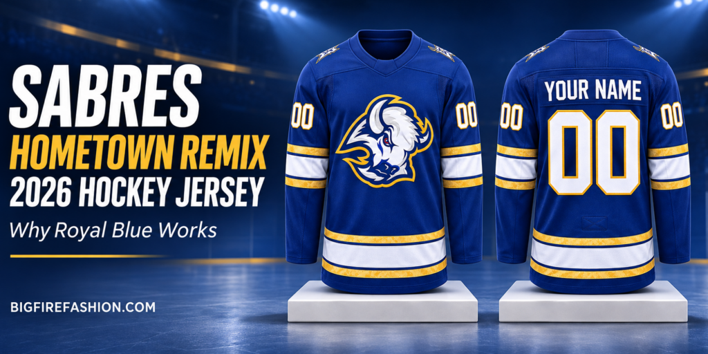
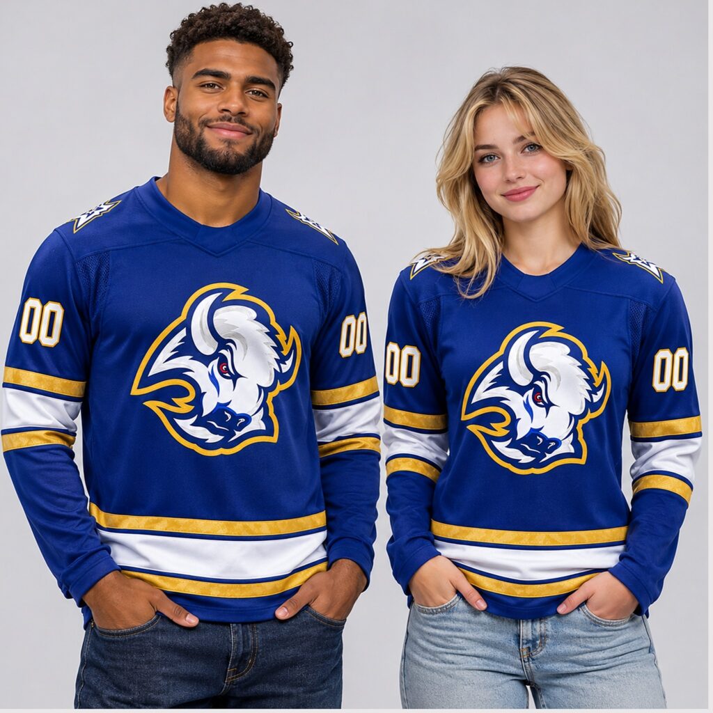
The chest graphic is the clearest reason to choose this design. A large white buffalo head occupies the center of the royal blue front, with blue and silver-gray shading defining the horn, forehead, mane, and muzzle. A gold border follows the outside of the crest, separating its irregular outline from the background.
That border does more than add another team color. It keeps the shape readable where the dark details within the buffalo meet the blue body. The white areas bring brightness to the middle of the jersey, while the blue shading creates definition within the illustration. Even with several internal lines, the head remains a single, recognizable focal point.
The small red eye adds a sharp accent. Because red appears so sparingly, it draws attention without changing the overall blue, white, and gold palette. It also gives the face a more intense expression than the surrounding colors alone would suggest.
There is generous blue space around the crest. This matters when the jersey is worn: the graphic has room to remain visually distinct from the sleeve numbers and lower stripes. The front feels organized because each major element has its own area.
Gold and White Stripes Give the Jersey Structure
The sleeves use broad white bands framed by gold, with narrow blue separations keeping the colors distinct. A corresponding stripe arrangement runs around the lower body. Repeating the pattern in these two places connects the arms to the torso and gives the jersey a consistent visual rhythm.
The white bands are particularly effective against royal blue. They create a clear break in the solid color, making the sleeves easier to distinguish from the body when your arms rest at your sides. The gold brings warmth to the palette and echoes the outline around the buffalo.
In the product images, the gold areas have a textured appearance. Their visual effect complements the crest border and number outlines. The main attraction, however, is the placement: each gold band helps frame a larger white area instead of competing with it.
Blue continues below the sleeve bands and beneath the lower stripe. That finishing space gives the cuffs and hem a defined edge. It also keeps the jersey from appearing visually cut off at the white band.
The Neckline and Shoulders Support the Main Graphic
The blue V-neck collar keeps the upper front simple. Its color blends into the body, leaving the buffalo as the strongest feature. The neckline creates a clean transition into the larger front panel, allowing the crest to remain unobstructed.
The shoulder areas feature smaller white-and-gold emblems. These add detail above the crest and remain visible from an angle, which helps the design carry around the garment. Their smaller scale is useful: they reward a closer look while allowing the chest graphic to lead.
The sleeve numbers sit above the striped bands. In the sample images, white digits with gold outlines repeat the treatment used on the back. Together, the shoulders, numbers, and stripes make the jersey recognizable from more than a straight-on view.
Personalization Makes the Back Part of the Design
The product photos show a sample back with “YOUR NAME” above a large “00.” These are personalization examples. The ordering form gives shoppers a choice about adding a custom name and number, making the back an important part of the purchase decision.
The name area uses white block lettering against blue. Below it, the oversized white number has a gold outline that separates it from the body. The arrangement leaves enough space between the name, digits, and lower stripe for each element to read clearly.
A family name, your own surname, or a meaningful number can give the jersey a connection beyond the team graphic. For a gift, that choice can be especially thoughtful when the recipient already owns other Buffalo apparel. It makes the item specific to the person receiving it.
Before submitting a personalized order, check every letter and digit. If you want a leading zero, a particular spelling, or special punctuation, confirm that the seller can reproduce it as intended. Also ask how longer names are handled if lettering size and spacing matter to you. Those small decisions affect the most prominent feature on the back.
How the Design Connects With the Hometown Remix Story
Buffalo’s Hometown Remix uniform was unveiled on November 2, 2026, with the club announcing eight scheduled appearances during the 2026–27 season. The team’s announcement connects the design to Buffalo’s identity as the City of Light. That gives the product’s name a specific sporting and local context.
The official uniform description develops that theme through an electrified shoulder symbol and lightning-and-star details. Those references explain the broader Hometown Remix concept; the particular retail jersey discussed here should be judged by its own listing and photographs.
On this version, the most immediate connection is visual. The royal blue foundation, gold trim, bold buffalo, and coordinated striping give shoppers a clear way to engage with the new look. You can appreciate that combination for its color balance and recognizable imagery even before exploring the story behind the uniform.
What to Know About Construction and Everyday Use
The product page identifies this as a long-sleeve hockey jersey with a V-neck collar and describes the design as embroidered. Its photographs show the crest, number outlines, shoulder details, and panel seams, giving buyers several areas to inspect before ordering.
If you have a specific requirement for fabric composition, garment weight, or the way custom lettering is attached, confirm it with the seller. Those details influence how a jersey feels and should come from the specifications for this item. A photo can communicate the appearance of a finish more clearly than its exact construction.
For everyday fan wear, think about how you want to use the jersey. A watch party may call for a simple layer over a T-shirt. An evening outside may require additional outerwear. Choose the rest of your outfit around the conditions, with the jersey supplying the team colors and main graphic.
Choose Your Size Around Your Preferred Layers
The ordering form lists adult sizes from S through 5XL and youth choices from YS through YXL. The size guide contains several garment categories, so use the hockey jersey section when checking measurements. Selecting the correct category is especially important on a page that also displays charts for other sports.
For adults, the hockey chart lists bust, front length, and back length separately. For example, the medium entry gives a bust measurement of 127 centimeters, a front length of 77.5 centimeters, and a back length of 85.1 centimeters. These correspond to approximately 50, 30.5, and 33.5 inches. The separate length measurements deserve attention if you prefer a particular hem position.
Measure a jersey you already like and compare equivalent dimensions. Check whether a chest figure represents the full circumference or a flat width before using it; those measurements cannot be compared directly. Ask the seller for clarification if the chart’s method is unclear.
Also account for the layer underneath. If you plan to wear a hoodie, assess the room you need through the chest, shoulders, and sleeves. For youth orders, compare current measurements with the relevant chart and confirm any unclear entries before choosing. A familiar size label is a starting point, while measurements provide a more useful basis for the final decision.
Let the Blue-and-Gold Palette Guide Your Outfit
This jersey already supplies a large graphic and several strong horizontal lines. Straight-leg dark jeans give it a straightforward game-day pairing, with enough contrast to keep the lower white stripe visible. Black pants produce a similar effect and work well if you want the blue to remain the brightest color in the outfit.
A plain white T-shirt underneath picks up the crest and sleeve bands. A neutral hoodie can work for layering, provided the jersey has the room you want. Keep additional graphics limited if your goal is to show the buffalo clearly.
For accessories, one repeated color is usually enough. A blue cap, a gold accent, or simple white sneakers can connect with the jersey without matching every detail. The design has sufficient character to carry the outfit on its own.
Follow the Listed Care Instructions
The product page recommends turning the jersey inside out and machine washing it cold on a gentle cycle with similar colors. It advises against bleach, fabric softener, and dry cleaning, and says to avoid ironing over the crest, name, or numbers.
For drying, the listing allows hanging or tumble drying on low. Follow the garment’s sewn-in care label if it provides more specific instructions. When storing the jersey, smooth the decorated areas and avoid forcing a sharp fold through the large back number. A little attention during washing and storage helps keep the presentation tidy between wears.
Where to Buy the Sabres Hometown Remix 2026 Hockey Jersey
You can find this jersey on bigfirefashion.com. Open the product page to review both views, choose the adult or youth style, select a size, and decide whether to add a custom name and number.
If you choose personalization, enter the requested details and review them alongside the size and quantity before adding the item to your cart. Check the current total after making your selections, then review shipping charges, delivery estimates, and the return terms that apply to your order.
For a birthday, holiday, or planned game outing, allow time for production as well as shipping. The page describes made-to-order production, so the date an item ships and the date it arrives are separate considerations. Resolve any questions about sizing or customization before payment, especially when ordering a personalized gift.
Conclusion: A Buffalo Jersey With a Clear Visual Identity
The Sabres Hometown Remix 2026 Hockey Jersey works because its details support one another. Royal blue gives the white goathead a strong setting, gold links the crest to the stripes and numbers, and the back offers room for a personal name and number without disrupting the layout.
Its appeal is easy to understand from either side: a commanding buffalo graphic on the front and a clear, coordinated arrangement on the back. For fans who enjoy Buffalo’s blue-and-gold identity and want a jersey they can personalize, this design offers a focused way to bring both preferences into one game-day piece.
